
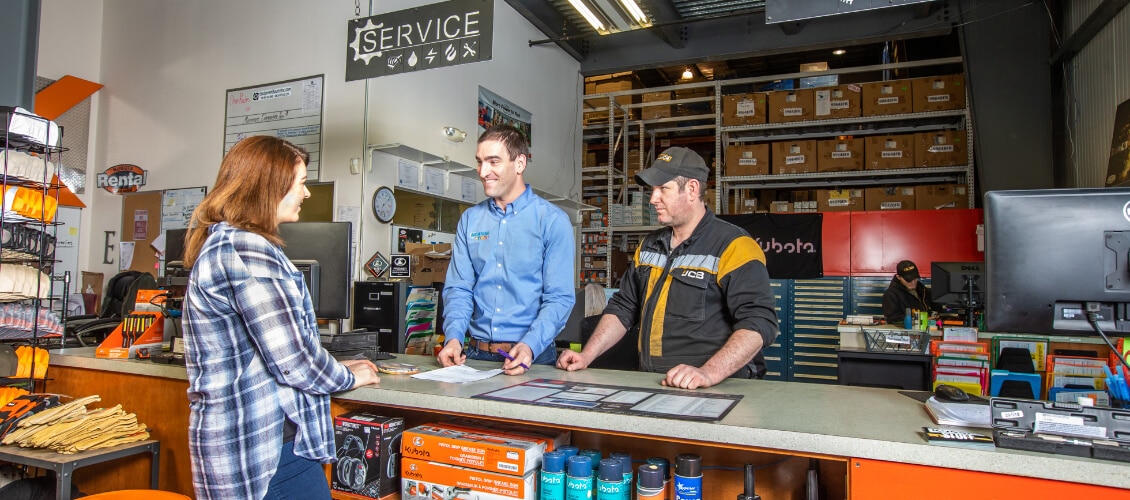
Meet Our Client
Equipment Source, Inc. (ESI) is the biggest equipment manufacturer in Alaska, engineering much of the custom equipment used by the oil and gas industry on the North Slope in -40° weather. They also vend many other equipment brands, and they are the sole vendor of Kubota in Alaska. They are committed to quality and reliability, with a line of awesome products that are “Built Arctic Tough.”
The Marketing Challenge
ESI was struggling with its corporate identity. The website focused so heavily on Kubota that many customers did not realize they offered other brands of equipment, let alone their own brand. In addition, their logo was outdated (think construction orange) and did nothing to communicate the broad range of equipment they offered in a visual way. Our client wanted an update that:
- Set them apart as a manufacturer and not just a distributor.
- Highlighted their unique position in the Alaska market.
- Showed that they offer a variety of equipment.
How We Got Results
We set out to capture these concepts in one, clear rebranding package. We also redesigned the website to enhance the user experience of every potential customer. This was all supported by ongoing marketing services, including content marketing, social media marketing, Facebook Ads, and Google Ads, to make ESI’s value proposition clear. It has been very successful in generating leads.
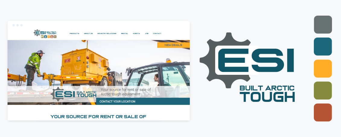
The rebrand started with the logomark, a gear to represent ESI’s role as a manufacturer and not just a vendor. The tagline, “Built Arctic Tough,” was put front-and-center, alongside the name. This is designed to further emphasize their engineering services for Alaskan environments.
In addition to the logomark, we gave ESI five icons to represent the five categories of equipment it manufactures and vends. This is based on the concept of the four original elements: heat, power, water, and earth. We included a fifth icon for “miscellaneous” equipment per their request, which reflects custom engineering. These icons were used together with the ESI logo to illustrate their wide portfolio of equipment offerings and separately whenever ESI needed to display separate categories of equipment, whether on the website, in advertising material, or in marketing collateral.
The colors and fonts brought new life to the ESI brand. We chose grey and blue for the logo to give a clean, engineered feel to the mark. In the icons, we incorporated warmer, earthy tones of green, yellow, and red to fit with the variety of outdoor environment in which ESI’s equipment is ultimately used. We chose fonts as bold as the people who work on the North Slope.
Our ongoing marketing services have also been extremely successful. In fact, a press release we published in 2020 earned them a feature article in Alaska Business Monthly magazine!
“Beacon Media + Marketing’s effort has made a huge impact on ESI. We have just been SLAMMED! We are getting great feedback on the social media videos and digital presence as well. We also have been approached for a news article based on your press release.”
Karen WilkenEquipment Source, Inc.

Let’s Connect + Chat
Face to face. Zoom. Phone. Email. Whatever you’re comfortable with.
Give us a call at (855) 208-4312 or fill out the form below for a free consultation.