
Whether you decided to create your own logo or you have a custom company logo professionally designed, you will have to face the decision of color. As humans, we are hardwired to respond emotionally to colors, so it’s worth putting some careful consideration into what you want to communicate with the colors in your logo and brand. Wondering what difference between a brand and a logo is? You’re not alone, check out my blog on corporate branding for more on that topic. And for the sake of this article, a logo is the actual icon part of your brand. For example, Nike’s swish is their logo. The brand is the overall identity of a company and encompasses elements like the photos used, the fonts, the colors, the messaging, the slogan, etc. Today, take a look at the following questions and take some time to put some thought into answering them for your company or organization.
What Emotions Do You Want Your Business Logo Design to Evoke?
The first step in knowing which logo color combination to choose is knowing your audience and what you want them to feel or think when they see your logo and brand. Start by defining who you want to reach. Give them a name, describe them, get to know them. You may be the target audience, or you may not be. Describe them so well that you feel like you can see them standing right in front of you! Write down what they like to eat for breakfast, lunch, dinner. Do they eat at home or do they prefer to eat out with their friends and co-workers at the cafe down the street? Do they live in the heart of the city? Are they more comfortable in suburbia? How do they get to work? Do they drive, ride the subway or bus, do they walk, do they ride their bike or their motorcycle? For that matter, what kind of motorcycle do they have, is it a cruiser or a crotch-rocket? Which generation are they from, are they the Silent Generation, Baby Boomers, Generation X, Xennials, Generation Y, Millenials, or iGen (Generation Z)? Do they have kids? Pets? Both? What do they do on their off time? Do they work, hike, play video games, take selfies, travel, teach, write, play with kids, golf, run, kayak, shop, eat, cook, bake, paint, draw, read, refurbish furniture, code video games, or travel? These are just some of the many questions you can answer to paint the picture of your future customer.
I’ll grant you that when you are first starting out with this endeavor of defining your target market, and you are creating this persona of your perfect client, there will be a lot of guesswork and that’s ok. Do the best you can. If a friend, a family member, the babysitter, or the waiter at your favorite restaurant seems like your ideal client, then ask them some of these questions. Focus in on your sublime customer and don’t worry about the other types of people who will also be interested in your company but aren’t your ideal. They will come anyway.
Once you know who your ideal client is, then take that next step to define how you would want them to feel about your company, your logo, your organization’s brand. Again, do some market research if you have access to people who are your target audience. Ask them what they feel about other brands that might be competitors, what do they think when they see that logo? What you want them to feel largely depends on how you want them to respond to your product or service or organization. For example, do you have a tech product that you want them to feel is exclusive, and they have to have it now to be hip and accepted by their peers (think the brand loyalty Apple has built)? Do you want them to donate to your animal rescue organization, or maybe be a foster pet parent, or adopt rescued animals? Do you have a business that offers home cleaning and errand running for busy and overworked moms? You want to make sure you tie in the emotional response to the colors with the desired action you want your target audience to take. McDonald’s and other fast-food chains are masters at this. They commonly use red, yellow, orange and other high energy colors that not only appeal to their target audience, but they evoke emotions of energy, excitement, and action. Think: “Stop now! Come in and eat our food! Move in and out fast, so there is room for our next customer!” Contrast this with Starbucks who uses earthy browns, greens, and mellow blues. They encourage people to come, sit, meet friends, talk, enjoy the coffee and the experience.
Understand how you want people to interact with your brand, and you will know which emotions you want to evoke with the colors in your logo.
What Do the Logo Colors Say to Your Target Audience?
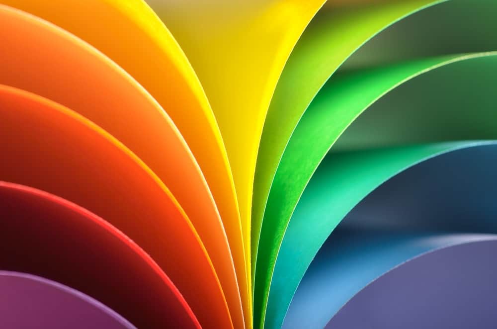
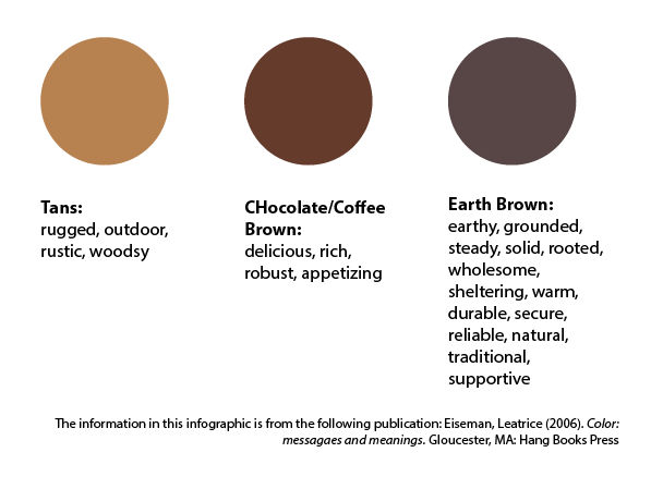
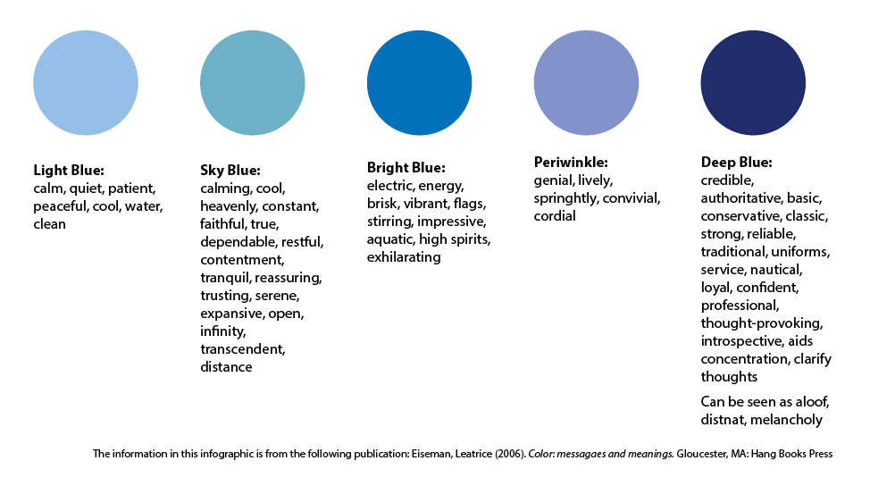
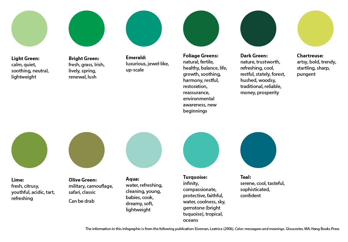
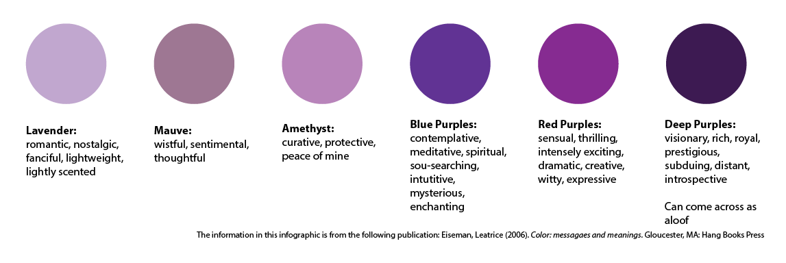
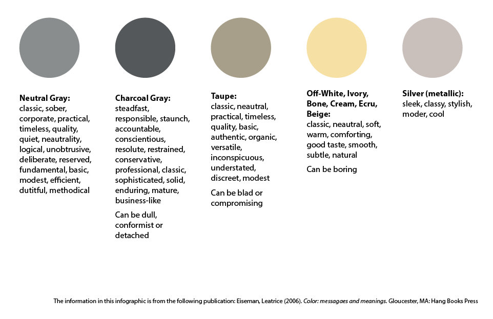
Now let’s look at the messages and meanings behind different colors you could use in your organization’s logo.
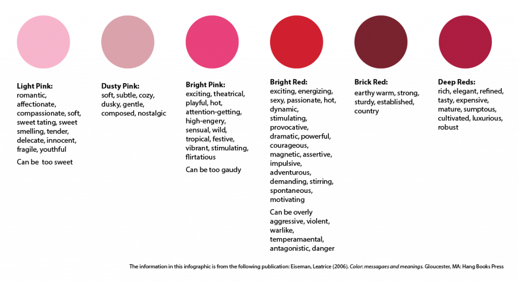
RED: The red family takes us from light pink all the way through deep reds. The red side of the spectrum brings to mind temptation, they titillate our senses and provoke us to take action. The bright reds demand we stop and pay attention, they steal the show and scream the loudest. They can express danger, celebration, or love. Bright pink is a shocking, more playful version of the attention-getting red family while the lighter pinks are softer, more feminine and even childlike.
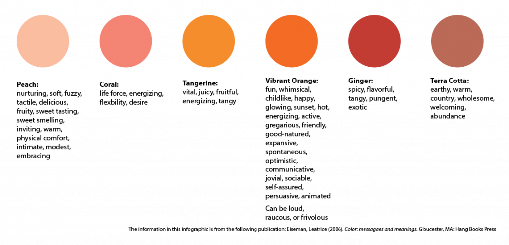
ORANGE: Orange was once a color (and a fruit) reserved for gods, emperors, and royalty though once the fast food industry embraced it in mid 20th century, it lost popularity in the high fashion and art crowds. However, the internet and tech boom has breathed new life into this vibrant color. Various shades of this color represent and share their names with food pumpkin, carrot, tangerine, etc. They are all inherently appetite stimulating. The shades of orange that move closer to red bring to mind many similar emotions as the red colors, but often less intimidating. The yellow shades of orange regularly communicate light and life. The deeper oranges bring to mind the earth and clay and evoke those wholesome and unassuming emotions.
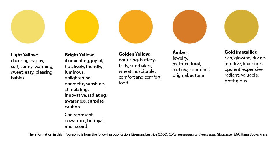
YELLOW: From our earliest years, yellow is a sign of light and warmth and is one of the most natural colors for our eyes to see. It grabs our attention and will either welcome us in or warns us of danger when combined with black. The brighter side of the yellow spectrum communicates warmth, life-giving light, joy, and optimism. We associate the warmer, golden tones in yellow with warm and comforting food. And finally, the metallic of this color, gold, has always communicated wealth, luxury, and rank in religious arenas.
BROWN: Browns are of the earth, and they bring to mind all of the wholesomeness that we often associate with the rustic outdoors and nature. A staple of woodsy and outdoor activities like camping, fishing, hunting, and hiking, it has become trendy for those who want to embrace or feel like they are embracing that lifestyle. The ties to the earth also make this a staple color for the organic and all-natural industries.
BLUE: Historically, blue has always reminded us of the tranquil sky reflected in calm oceans, and the lighter blues continue to communicate this today. Deep blues tend to be more mysterious, think deep and potentially turbulent seas. There is a strength but also a sternness to the darker blues. Blue is the most used color in corporate branding, and it is a struggle now to find shades that are not already in use. Even though it is also one of the most common colors online, statistics show it is the least responded to color in social media postings.
GREEN: In the world around us there are more shades of green than any other color so it follows that there are a lot of moods and emotions that green can evoke. New beginnings are the most common but depending on the shade green can also bring relaxation and detoxification. Green is the balance of blue and yellow and so it can communicate harmony. The turquoise shades are the blend of blue and green and in many cultures they carry religious importance. Most commonly the shades of turquoise and teal bring to mind compassion, healing, and the cleansing properties of water and life.
PURPLE: This color is a complex and intriguing combination of blue and red. Tip the purple more to the red side of the spectrum, and it will bring out more of the energy and intensity. Similarly, when shaded with more blue tones the purple will now seem more pensive, calming, and lofty.
Neutrals: In the color spectrum, gray is precisely between black and white, so it is the perfect neutral. However, rarely will you ever find a “perfect” gray, most often grays will have complex undertones of blue, green, or even pink. In corporate branding, gray is a balanced and neutral background for brighter, more vibrant colors like orange, blue, red, or purple. Gray can also evoke mystery and sophistication in the right context and together with the ivory shades is often found in natural, upscale products. Silver is the most exciting of the spectrum in that it inherently has a sense of movement to it and calls to mind the light from the moon.
WHITE & BLACK: Hilary Mandleberg said it well “white is gently romantic or starkly modern, depending on how you use it,” Our eyes are sensitive to white and perceive it to have the same vibrancy as brilliant colors, so it should never be used as a “neutral” in your branding package or logo design. While white is the abundance of light, black is the total absence of color. Black is always “in” and is as polarizing as white. It can bring to mind villains, harshness, evil, darkness, gloom and doom. Or we can see black as sophisticated, glamorous, powerful, rich, and classic.

While there are many constants in the perception of colors, as you can see from the illustrations above, there are just as many variations. Our interpretation of color is subjective, so it is essential to use these color guides and get feedback from your target audience. I have to say that again; it’s that important….get feedback from your TARGET AUDIENCE. What emotions your aunt or next door neighbor feels when they see your logo colors may be unusual, but if they aren’t your target marketing, then it really doesn’t matter. They aren’t the ones you are trying to reach with those colors. You need to get feedback from the ones who will be interacting with and buying your products or services. It may sound harsh, but these are the ones that matter. A professional agency that specializes in branding will have a sense of what colors are going to appeal to which audiences and age groups. Understanding something about the psychology of color is vital whether you’re designing your own logo and working with professionals because, at the end of the day, it’s your logo and your logo colors. Who knows, you may even be wearing that color at work all day. It helps to understand why! If you’re interested in talking about how color can change your branding and messaging, I would love to chat. Shoot me an email at[email protected], and we can connect!