

There are lots of different factors that Google’s algorithm takes into consideration when deciding whether or not to rank your webpages and blog posts on its results page. Things like keywords, backlinks, headings and sub-headings, metadata and alt-text all play a part in helping the algorithm understand whether or not a page provides a high-quality answer to a search query.
One thing you might not have considered before is mobile friendliness.
Recently, Google’s developers rolled out a handy mobile-friendly test. It allows you to drop in your website’s URL or code so Google. It takes a few minutes to run, and hey presto! It spits out a results page that will let you know whether or not your website is up to scratch.
Here’s an example, using the Beacon Media + Marketing site:
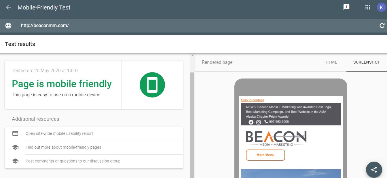
As you can see, the page works. However, it also spits out a list of errors – for example, things like images – that could be replaced, edited or optimized to ensure results are optimal.
Want to talk to a real person? Schedule a free consultation.
Why is mobile-friendliness important for SEO?
Google’s developers actually want to help you create content that ranks. Why? Google distinguished itself from its competitors early in the search engine race by ranking high-quality results for every search query. It has a vested interest in ensuring internet users quickly find the answers they’re looking for, which is why the algorithm has been programmed to look for webpages that are informative, well-written, and fast-loading. It’s designed to give people what they want.
Mobile-friendliness is a key part of this. According to the description on the mobile-friendly test tool page, Google notes that smartphone traffic has exceeded desktop traffic in many countries:
“In the USA, 94% of people with smartphones search for local information on their phones. Interestingly, 77% of mobile searches occur at home or at work, places where desktop computers are likely to be present.”
That’s why it’s important to optimize design so it can be viewed seamlessly across a variety of devices. If text is too small, or the website uses Flash software (which isn’t supported by most devices), the user is likely to have a bad experience, which means they’ll click away and look elsewhere.
This isn’t good for you, because you’ll lose potential leads, but it’s also not good for Google, because its business model depends on giving people the best information as quickly as possible.
Read more: 6 expert ways to add SEO to your website
Errors that will affect mobile-friendliness
Lots of little things can have a detrimental impact on the way your website ranks for mobile friendliness. Here are some of the common ones Google identifies:
- Incompatible plugins. We recommend redesigning your website every two or three years to ensure it’s up-to-date with the latest technologies and best practice. Old plugins can cause all sorts of problems, ranging from technical glitches to bad SEO rankings. A web developer will be able to help you clear all those things up and optimize your code.
- Viewport not set. Modern websites need to specify a “viewport property,” which basically tells the browser how to adjust the page to fit onto each device. It’s important because different elements like text, images, video and links may need to shuffle into different spots to be accessible on screens of different sizes.
- Content wider than screen. If this sounds familiar, you’ve got a big problem. In the early days of mobile phones, people were happy to zoom in and out on different parts of a website to find the information they need. Modern consumers, however, want answers five minutes ago. The internet is a fiercely competitive place, so if consumers can’t find what they need, they’ll simply look to your competitors. Make it easy for them.
- Text too small to read. Again, consumers won’t work harder than they need to, so make your website as friendly and inviting as possible.
- Clickable elements too close together. This is a really important one now that mobile devices have grown in popularity. When you’re using a desktop computer, it’s easy to use the mouse to deftly click on any elements that you please, but people’s fingers aren’t so precise. Spacing clickable elements out will make it much easier to access information on the move.
Read more: 9 telltale signs it’s time to re-design your website
Cost of building a mobile-friendly website
How much is one customer worth to you? Chances are, that’s already made a new website worthwhile. The cost of developing a new website can vary widely, depending how many webpages you’ll need, how customized it needs to be, and what interactive features you need to include. However, all modern web developers will ensure your site is mobile-friendly.
At lower price points, many web development companies offer templates you can choose from. These templates will be optimized for things like online stores, hospitality businesses with booking systems, portfolios, and so on. They’re great for small businesses, because they’ll get you up and running and will allow you to overhaul your site with a fresh design and optimized SEO strategy.
At higher price points, you may be looking at a custom build. This is the best choice if you’re looking to create something unique, incorporate lots of interactivity, and potentially win awards. These websites will be built with your needs in mind from the ground up, which means they will be a better choice for medium-large companies looking to optimize a lot of information.
Either way, a web development company will meet with you to talk about your needs, analyze your competitors, identify your likes and dislikes, define your goals and ensure your vision comes to life. Over the past few years, mobile-friendliness has become a key part of this process.
Read more: Website design and development services
Making a mobile-friendly website
Mobile friendliness serves two purposes: it increases the likelihood that Google will rank your website on its results page, and it increases the likelihood that internet users will stick around long enough to actually read your content, engage with your site, and potentially become a lead.
The best way to make your website mobile-friendly is to ensure the back-end is sparkling (i.e. that the digital nuts and bolts are all working) and that the design is simple. Fortunately, modern website design favors trends like oversized fonts, slabs of color, visible grids and videos. These elements are all quite blocky, which means it’s easy to arrange them in different ways to suit different devices.
Google is estimated to process about 40,000 queries every second, or about 3.5 billion searches per year, so it’s important to do everything you can to stand out from your competitors. A functional website forms the core of every successful digital marketing strategy, so once your website is working as it should, you’ll be able to develop social media and content strategies that make a splash.
Ready to get started?Schedule a free consultation.