Explore insights on SEO, AI, and digital marketing strategies designed to help your business grow, stay visible, and adapt in a constantly evolving online landscape.
“Show, don’t tell” is an idiom commonly used by writers of all stripes. The idea itself is simple: don’t tell your readers what to think, feel, or expect about your topic. Instead, you want to “show” them the data, facts, and evidence as concisely and as powerfully as possible. When done well, you are far more likely to instill whatever you were trying to communicate in a way that’s lasting and powerful.
Infographics are an incredibly effective way of distilling sometimes complicated data into something succinct and visually impactful. They take data that may be difficult for our brains to process through words and allow the significance of the data to shine through. It’s no surprise, then, that an infographic is up to 30 times more likely to be read than an article.*
That being said, not all infographics are created equal. Here are 5 tips to ensure yours are as effective as possible.
Tip 1: Start With the Data
Not all information is best communicated visually. If the message you’re trying to communicate can be effectively stated and easily digested in one or two sentences, it probably ought to be.
It may be tempting to add fun graphics and visual elements to every part of your blog, whitepaper, or website content, but there are reasons to keep information as text. Text has a huge impact on SEO, or Search Engine Optimization, while images will have very little. Don’t just take text content and turn it into an image.
Instead, use infographics for data that tells a story. Infographics can be much more effective as communicating statistics than paragraphs of text. Moreover, a simple, visual representation of data can leave a very strong and very obvious impression.
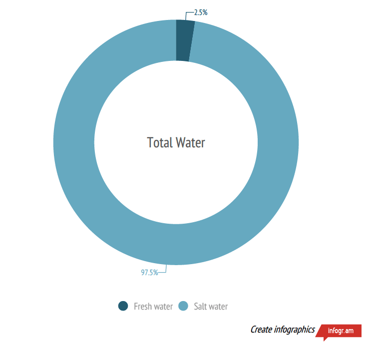
This infographic is extremely simple, but it immediately conveys the narrative of the data: that fresh water is scarce. It takes information that’s well-suited to an infographic and employs it in an impactful way.
Tip 2: Less Information is More Impactful
Have you ever seen a graphic that looked stylish but was difficult to interpret?
This wonderfully ironic infographic tries to answer the question of whether your content should be visual or not. Unfortunately, this incredibly busy flowchart would be much easier to read as five separate infographics, not one. Don’t get bogged down in details. Boil your information down to what’s most important – anything else will obscure, not clarify.
Tip 3: Respect the Data
Once you’ve chosen what to make into an infographic, let the demands of the data dictate what that infographic looks like. It may be tempting to format your graphic with flashy visuals or unusual graphs, but you should only do so when it benefits the digestibility of the data. Infographics should always make data easier to understand, not more difficult. And it should always represent that data as accurately as possible.
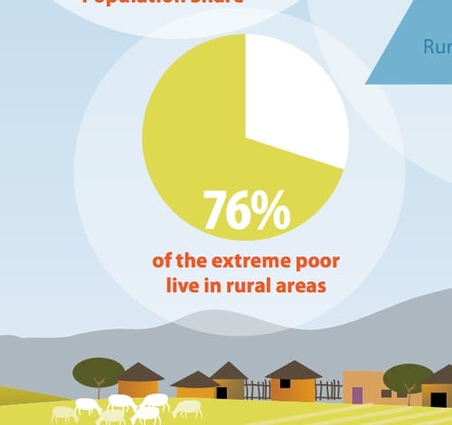
This unfortunate pie chart is mysteriously not 76% shaded. Not that your graphics must be accurate down to the last pixel, but make sure it actually represents the information with integrity.
Tip 4: Not Too Big, Not Too Small
If an infographic is too large, it will require excessive amounts of scrolling and may be almost entirely un-viewable on a mobile device. If it’s too small, it may not be legible.
Make sure text is large enough to be legible even when viewed at 50% magnification. Generally speaking, a good width for an infographic is 600 – 800 pixels.
Some infographics are long and meant to be scrolled through. To meet best practices, we advise not usually going over 8000px long.
Tip 5: Share It!
Infographics can be a really impactful marketing tool, but only if you actually use them.
The same graphic can be used across blogs, websites, and whitepapers. Get the full value out of your design!
Make sure your infographic is easily shareable on social media – consider using plugins to add a Facebook share button or a “Pin It!” Pinterest button.
Share it, ask users to share it, and ask reputable partners in your niche to share it. Promote it the same way you would promote any of your valuable content.
Conclusion
As primarily visual creatures, infographics have the ability to immediately captivate and communicate in a way that words can’t. However, a little goes a long way! Remember to focus on the story that the infographic tells – the significance of the data it’s representing – in order to make the most interesting and shareable graphic possible.
Whether you decided to create your own logo or you have a custom company logo professionally designed, you will have to face the decision of color. As humans, we are hardwired to respond emotionally to colors, so it’s worth putting some careful consideration into what you want to communicate with the colors in your logo and brand. Wondering what difference between a brand and a logo is? You’re not alone, check out my blog on corporate branding for more on that topic. And for the sake of this article, a logo is the actual icon part of your brand. For example, Nike’s swish is their logo. The brand is the overall identity of a company and encompasses elements like the photos used, the fonts, the colors, the messaging, the slogan, etc. Today, take a look at the following questions and take some time to put some thought into answering them for your company or organization.
What Emotions Do You Want Your Business Logo Design to Evoke?
The first step in knowing which logo color combination to choose is knowing your audience and what you want them to feel or think when they see your logo and brand. Start by defining who you want to reach. Give them a name, describe them, get to know them. You may be the target audience, or you may not be. Describe them so well that you feel like you can see them standing right in front of you! Write down what they like to eat for breakfast, lunch, dinner. Do they eat at home or do they prefer to eat out with their friends and co-workers at the cafe down the street? Do they live in the heart of the city? Are they more comfortable in suburbia? How do they get to work? Do they drive, ride the subway or bus, do they walk, do they ride their bike or their motorcycle? For that matter, what kind of motorcycle do they have, is it a cruiser or a crotch-rocket? Which generation are they from, are they the Silent Generation, Baby Boomers, Generation X, Xennials, Generation Y, Millenials, or iGen (Generation Z)? Do they have kids? Pets? Both? What do they do on their off time? Do they work, hike, play video games, take selfies, travel, teach, write, play with kids, golf, run, kayak, shop, eat, cook, bake, paint, draw, read, refurbish furniture, code video games, or travel? These are just some of the many questions you can answer to paint the picture of your future customer.
I’ll grant you that when you are first starting out with this endeavor of defining your target market, and you are creating this persona of your perfect client, there will be a lot of guesswork and that’s ok. Do the best you can. If a friend, a family member, the babysitter, or the waiter at your favorite restaurant seems like your ideal client, then ask them some of these questions. Focus in on your sublime customer and don’t worry about the other types of people who will also be interested in your company but aren’t your ideal. They will come anyway.
Once you know who your ideal client is, then take that next step to define how you would want them to feel about your company, your logo, your organization’s brand. Again, do some market research if you have access to people who are your target audience. Ask them what they feel about other brands that might be competitors, what do they think when they see that logo? What you want them to feel largely depends on how you want them to respond to your product or service or organization. For example, do you have a tech product that you want them to feel is exclusive, and they have to have it now to be hip and accepted by their peers (think the brand loyalty Apple has built)? Do you want them to donate to your animal rescue organization, or maybe be a foster pet parent, or adopt rescued animals? Do you have a business that offers home cleaning and errand running for busy and overworked moms? You want to make sure you tie in the emotional response to the colors with the desired action you want your target audience to take. McDonald’s and other fast-food chains are masters at this. They commonly use red, yellow, orange and other high energy colors that not only appeal to their target audience, but they evoke emotions of energy, excitement, and action. Think: “Stop now! Come in and eat our food! Move in and out fast, so there is room for our next customer!” Contrast this with Starbucks who uses earthy browns, greens, and mellow blues. They encourage people to come, sit, meet friends, talk, enjoy the coffee and the experience.
Understand how you want people to interact with your brand, and you will know which emotions you want to evoke with the colors in your logo.
What Do the Logo Colors Say to Your Target Audience?
Now let’s look at the messages and meanings behind different colors you could use in your organization’s logo.
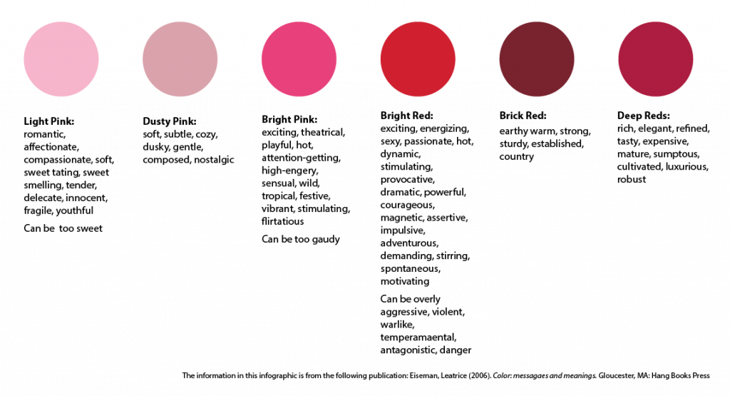
RED: The red family takes us from light pink all the way through deep reds. The red side of the spectrum brings to mind temptation, they titillate our senses and provoke us to take action. The bright reds demand we stop and pay attention, they steal the show and scream the loudest. They can express danger, celebration, or love. Bright pink is a shocking, more playful version of the attention-getting red family while the lighter pinks are softer, more feminine and even childlike.
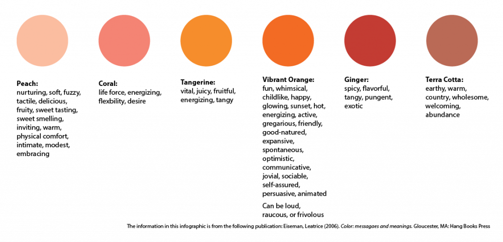
ORANGE: Orange was once a color (and a fruit) reserved for gods, emperors, and royalty though once the fast food industry embraced it in mid 20th century, it lost popularity in the high fashion and art crowds. However, the internet and tech boom has breathed new life into this vibrant color. Various shades of this color represent and share their names with food pumpkin, carrot, tangerine, etc. They are all inherently appetite stimulating. The shades of orange that move closer to red bring to mind many similar emotions as the red colors, but often less intimidating. The yellow shades of orange regularly communicate light and life. The deeper oranges bring to mind the earth and clay and evoke those wholesome and unassuming emotions.
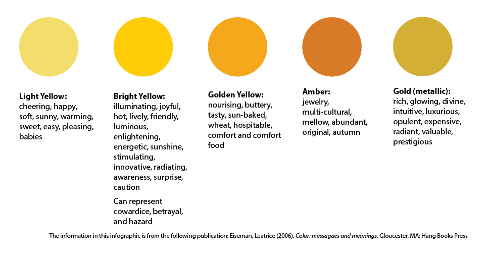
YELLOW: From our earliest years, yellow is a sign of light and warmth and is one of the most natural colors for our eyes to see. It grabs our attention and will either welcome us in or warns us of danger when combined with black. The brighter side of the yellow spectrum communicates warmth, life-giving light, joy, and optimism. We associate the warmer, golden tones in yellow with warm and comforting food. And finally, the metallic of this color, gold, has always communicated wealth, luxury, and rank in religious arenas.
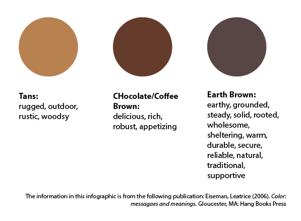
BROWN: Browns are of the earth, and they bring to mind all of the wholesomeness that we often associate with the rustic outdoors and nature. A staple of woodsy and outdoor activities like camping, fishing, hunting, and hiking, it has become trendy for those who want to embrace or feel like they are embracing that lifestyle. The ties to the earth also make this a staple color for the organic and all-natural industries.
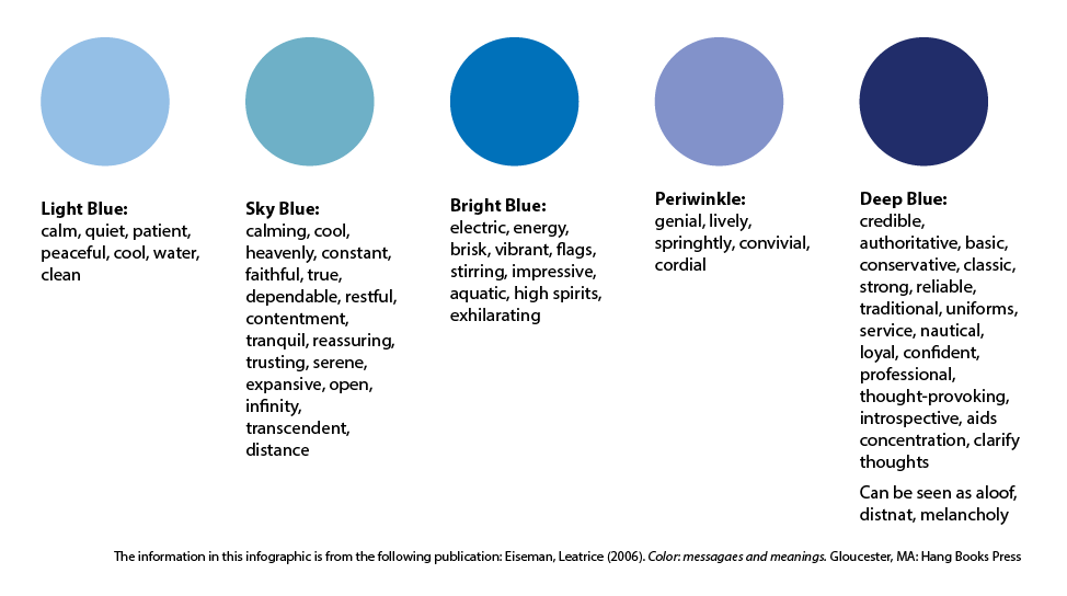
BLUE: Historically, blue has always reminded us of the tranquil sky reflected in calm oceans, and the lighter blues continue to communicate this today. Deep blues tend to be more mysterious, think deep and potentially turbulent seas. There is a strength but also a sternness to the darker blues. Blue is the most used color in corporate branding, and it is a struggle now to find shades that are not already in use. Even though it is also one of the most common colors online, statistics show it is the least responded to color in social media postings.
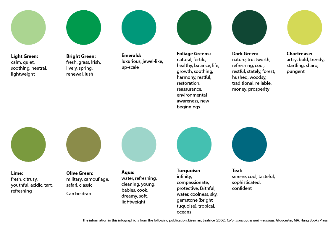
GREEN: In the world around us there are more shades of green than any other color so it follows that there are a lot of moods and emotions that green can evoke. New beginnings are the most common but depending on the shade green can also bring relaxation and detoxification. Green is the balance of blue and yellow and so it can communicate harmony. The turquoise shades are the blend of blue and green and in many cultures they carry religious importance. Most commonly the shades of turquoise and teal bring to mind compassion, healing, and the cleansing properties of water and life.
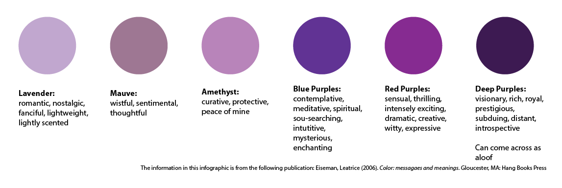
PURPLE: This color is a complex and intriguing combination of blue and red. Tip the purple more to the red side of the spectrum, and it will bring out more of the energy and intensity. Similarly, when shaded with more blue tones the purple will now seem more pensive, calming, and lofty.
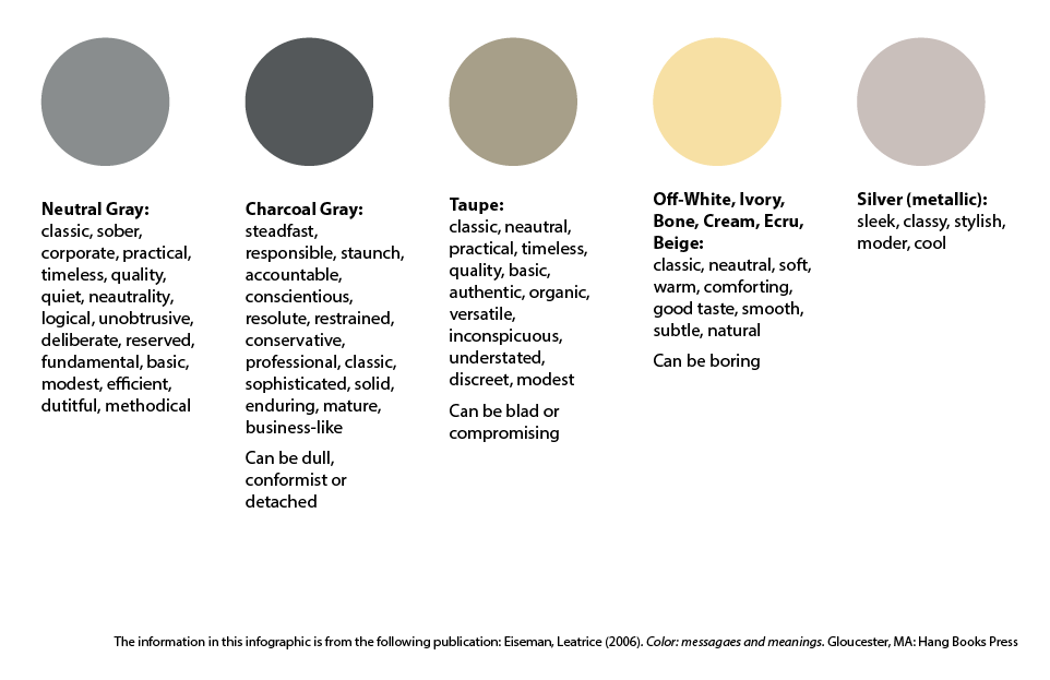
Neutrals: In the color spectrum, gray is precisely between black and white, so it is the perfect neutral. However, rarely will you ever find a “perfect” gray, most often grays will have complex undertones of blue, green, or even pink. In corporate branding, gray is a balanced and neutral background for brighter, more vibrant colors like orange, blue, red, or purple. Gray can also evoke mystery and sophistication in the right context and together with the ivory shades is often found in natural, upscale products. Silver is the most exciting of the spectrum in that it inherently has a sense of movement to it and calls to mind the light from the moon.
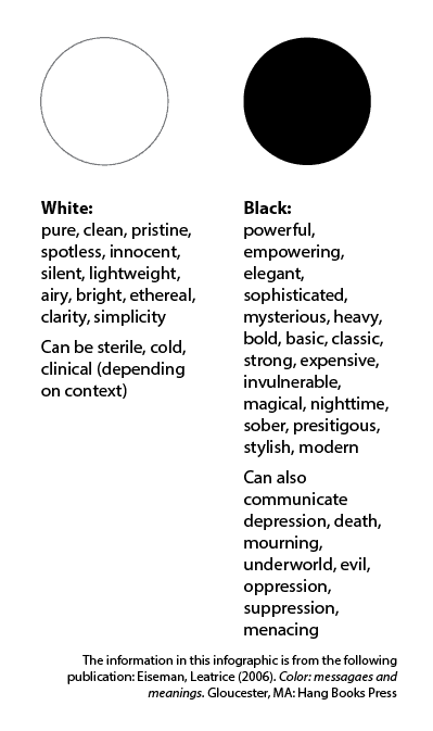
WHITE & BLACK: Hilary Mandleberg said it well “white is gently romantic or starkly modern, depending on how you use it,” Our eyes are sensitive to white and perceive it to have the same vibrancy as brilliant colors, so it should never be used as a “neutral” in your branding package or logo design. While white is the abundance of light, black is the total absence of color. Black is always “in” and is as polarizing as white. It can bring to mind villains, harshness, evil, darkness, gloom and doom. Or we can see black as sophisticated, glamorous, powerful, rich, and classic.
While there are many constants in the perception of colors, as you can see from the illustrations above, there are just as many variations. Our interpretation of color is subjective, so it is essential to use these color guides and get feedback from your target audience. I have to say that again; it’s that important….get feedback from your TARGET AUDIENCE. What emotions your aunt or next door neighbor feels when they see your logo colors may be unusual, but if they aren’t your target marketing, then it really doesn’t matter. They aren’t the ones you are trying to reach with those colors. You need to get feedback from the ones who will be interacting with and buying your products or services. It may sound harsh, but these are the ones that matter. A professional agency that specializes in branding will have a sense of what colors are going to appeal to which audiences and age groups. Understanding something about the psychology of color is vital whether you’re designing your own logo and working with professionals because, at the end of the day, it’s your logo and your logo colors. Who knows, you may even be wearing that color at work all day. It helps to understand why! If you’re interested in talking about how color can change your branding and messaging, I would love to chat. Shoot me an email at[email protected], and we can connect!
Originally published on April 9, 2018. Updated on April 21, 2020.
The American Marketing Association (AMA) defines a brand as a “name, term, sign, symbol or design, or a combination of them intended to identify the goods and services of one seller or group of sellers and to differentiate them from those of other sellers.”
Basically, it’s what comes to people’s minds when they hear your company name or see your logo.
Your brand is a combination of three things: personality, image, and core competencies. It’s the impressions you make as well as the words people use to describe your company to others.
It’s easy to see why it’s so important. Your brand resides within the hearts and minds of customers, clients, and prospects. It is the sum total of their experiences and perceptions.
A strong brand creates customer satisfaction and helps establish the longevity of a company. It gives a company legitimacy and respectability. It creates solidarity and loyalty within and without. It will also deliver the message clearly, confirm your credibility, connect your target prospects emotionally, and motivate the buyer.
What does that mean for you? Continuity. Continuity. Continuity. What is continuity? It is making sure that everything you do as a company has a coordinated look and feel about it. Graphically, this translates into a few things including the standard logo, corporate colors, a particular typeface, even a photo or illustration style.
Often, different departments within a company grab logos and typestyles and use them with haphazard abandon on everything from data sheets to PowerPoint presentations. They may ignore mandates from the home office and create their own marketing pieces, which bearing little-to-no resemblance to the carefully crafted look created by their own marketing department. The result is always the same – the company’s identity is diluted.
The worst-case scenario is that a lack of effective, unified marketing results in a drop in market share. That, in turn, requires a needless squandering of marketing resources to re-establish the company’s former brand awareness in the marketplace. Continuity helps achieve levels of image and branding efficiency unavailable to practitioners of hit-or-miss marketing with little or no image consistency between messages and media.
A brand encompasses the consumer’s experience and provides consumers with an avenue through which they can interact with the business. Fundamentally, people are emotional. Feelings like inspiration, positivity, trust, loyalty play a big part in our decision to interact with a business, buy a product or sign-up for a service.
As such, a positive brand can influence the buying habits of its target audience. Every sector has competition, regardless of whether your business is in functional health, construction, the not-for-profit sector or the beauty industry.
A brand will tell your prospectives what the beating heart of your company is about and why it’s different from its competitors. It’s both a first impression and a long-term relationship. Getting noticed is important, but so is telling people what your business aspires to become. Dreams are very persuasive.
Designing a corporate brand
As we mentioned earlier, branding consists of three main elements: company personality, image, and core competencies and characteristics. We’re now going to dive into that a little bit further.
When you’re designing your corporate brand, it’s important that the imagery and messaging associated with your brand reflects these so they reinforce the company’s story and establish a connection with customers. There are lots of different ways you can do this – for example, by inserting symbolism in your imagery.
Lots of brands do this in one way or another. For example, have you ever noticed the FedEx logo has an arrow pointing forward between the E and the X? It subtly reinforces the brand story.
How about the fact that the arrow in Amazon points from A to Z? Again, it sums up the business by subtly indicating the product line includes everything.
And what about Cisco? The lines in the background allude to the Golden Gate Bridge, which shows the brand’s San Francisco roots and therefore gives it a dose of personality.
Similar principles apply to brand stories.
With Airbnb, for example, you can “Belong Anywhere.” Nike will help you “Just Do It”. United Airlines will help you “Fly The Friendly Skies.” Even the U.S. Army is encouraging you to “Be All You Can Be.” Each of these slogans is a brand story. They summarize each organization’s personality, values and core competencies.
Developing slogans is not an easy task, so you may benefit from the help of a professional marketing agency. Striking the right tone is incredibly value from a brand awareness point of view. Keeping it coordinated and consistent will help the public understand what your business is about so they can find you when they need you.
There’s no shortage of firms that use two, three, even four versions of their logo on a regular basis, with no particular rhyme or reason. The same goes for corporate colors – often a victim of one or more employee’s personal taste (“I HATE that color, I’m going to use green instead!)
This carelessness is made even easier by the proliferation of PowerPoint, Publishers and other tools used by more and more employees. The longer this continues, the more it will cost your company in time, money, awareness and – ultimately – market share. Think of it this way: how many variations have you seen of the Walmart logo? How about McDonald’s? Amazon? Facebook? AT&T? Ford?
Big companies know that value of a strong brand. Their logos are instantly recognizable, which generates a feeling of trust among customers. They are familiar with the stories of these brands, the legacies, so they keep coming back. It makes sense, then, to establish company-wide standards and maintain them.
Issue a simple style sheet that everyone can understand and follow and then enforce it. Make graphical elements of your company images available to the people that might need them and enforce their use. Help remind employees that it is about putting the end user before the personal tastes of individual team members.
A strong brand enables a company to prosper and grow at a healthy rate while ensuring longevity.
Here at BEACON, our social media content creators use the website Canva.com to streamline the creation of online graphics. It’s actually a really great program for those with little to no graphics training but it, unfortunately, has one flaw: the amount of fonts available are overwhelming!
As the Type Wizard on staff (think they’d mind that being my official title?), I have put together a handy guide for fonts and how they tie into Canva.com. This guide touches on the basics of font terms, use, and dos & don’ts. If you have ever been confused by terms like “serif” or cannot figure out how to make type stand out over an image, then this guide is for you.
Knowing which file type to send to your design team (and how to send it) can end up saving you some time and headaches in the long run. But what exactly are “vectors”? And why does “ppi” even matter? Here is our handy guide to help clarify some of our design terms!
Logos come in two types of graphic files: raster and vector. Raster files are made of pixels or many little blocks of a single color each. The best example of this concept is A Sunday Afternoon on the Island of La Grande Jatte. I’m sure you’ve seen this painting, if not in person then maybe in movies or online. When you get up close, you’ll see the painting is made up of dots… many, many dots. The further away you move from it, the clearer the picture becomes. (Wait, you mean those dots are actually people?) Raster files work the same way. We can make them smaller and keep them looking clear, but we cannot increase their size and expect to see anything other than the “dots” (or pixels) that make up the graphic.
“But isn’t there a way to resize logos and have them look great no matter the size?” Fear not, dear reader, there is: vectors!
Vector graphics are made of mathematical points to create lines, objects, colors, etc. What exactly is so magical about that? Math makes it possible for files to be resized to either tremendously large or incredibly small, while keeping all of the original details! Need your logo on a small keychain? Or possibly the side of your building? No problem! With vector files there is no limit to what we can do with your logo.
Raster File Types: JPG, GIF, TIF Vector File Types: AI, EPS Files that straddle the fence: PDF and PNG files can have both vector and raster items within their layers.
PPI stands for Pixels Per Inch. While I’m sure you may find this acronym to be incredibly interesting, you may also be wondering how this pertains to you and your logo. When you upload your logo to Facebook, for example, the website automatically lowers the resolution of your graphic to 72ppi. Don’t worry; I don’t plan on getting incredibly technical with this. All this really means is that your graphic is now optimal for viewing online.
“It looks so clear on my screen. Why does it look grainy when I print from the web?” Images built for web (mainly social media) weren’t intended for printing. Ideally, print materials are set to 300ppi to ensure clarity. Your graphics may have begun at 300ppi but, again, if they were uploaded to the web using a website like Facebook or WordPress those pixels were automatically lowered to ensure fast web loading times. This is why the original file works better than pulling them off of your Facebook page. The more pixels the better!
If you simply don’t have a vector file for your logo or even a high-resolution raster file, that’s not a problem. Some file types may just mean a few extra steps in the process but rest assured that we can work with whatever you have!
We are a visual society that consumes digital data at an insane rate. One of the best ways to communicate large amounts of data is an infographic.
Offer precise and compelling data.
Choose the data you would like to share and simplify it into numbers, graphs, and icons. Only share information that is relevant and exciting, you want your infographic to grab attention, which is hard to get online.
Get Creative.
Keep in mind that most people are visual and will tend to share a visually striking post over solid text. Use icons, colors, and typography in a way that portrays your message. For example, if your infographic were about Alaskan winters, you wouldn’t want to show palm trees. However, if you’re selling winter vacations, palm trees could be a perfect element. No matter what your visuals are, make sure they’re relevant.
Spread the word.
The purpose of an infographic is that it will be shared and bring new visitors back to your page and to your company. Start by sharing your infographic on your blog and website, since this is where you eventually want them to come back to. Link your infographic to your social media pages (Facebook, Twitter, Instagram, Pinterest, etc.), email newsletter, and by sharing with fellow businesses.
Use your infographic.
Infographics don’t need to stop at the web. They translate very easily into video, using music and transitions to create a more dynamic message. They can also be used in print for posters, media kits, annual reports, and in brochures. Once you have the design, there are endless possibilities on how you use it.
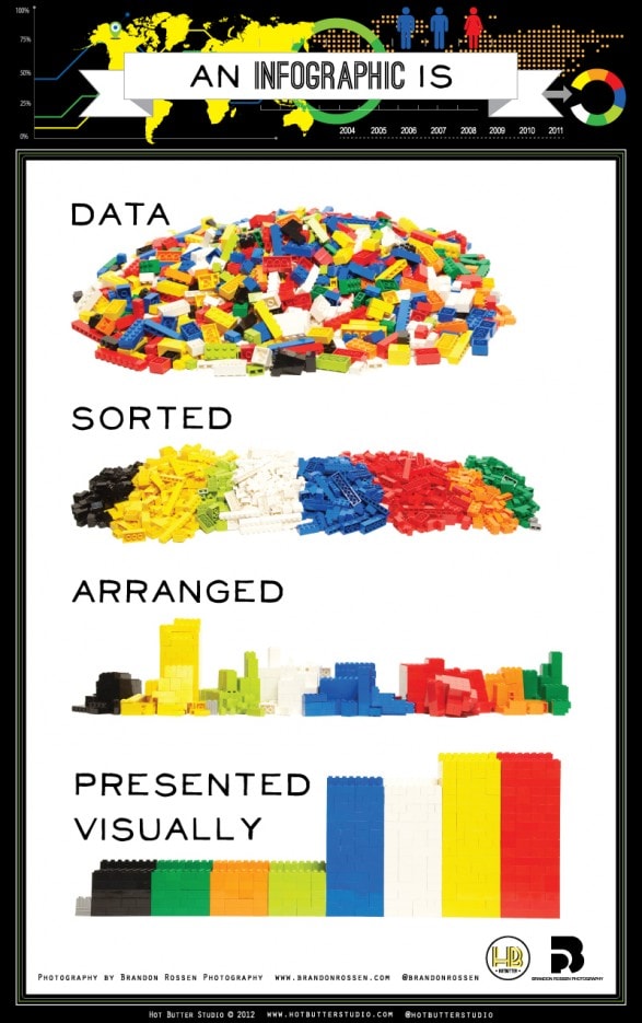
This blog post wouldn’t be complete without an infographic, so here’s an example of one that will help to get the ball rolling for your next visual post!
 Skip to content